The Huddle
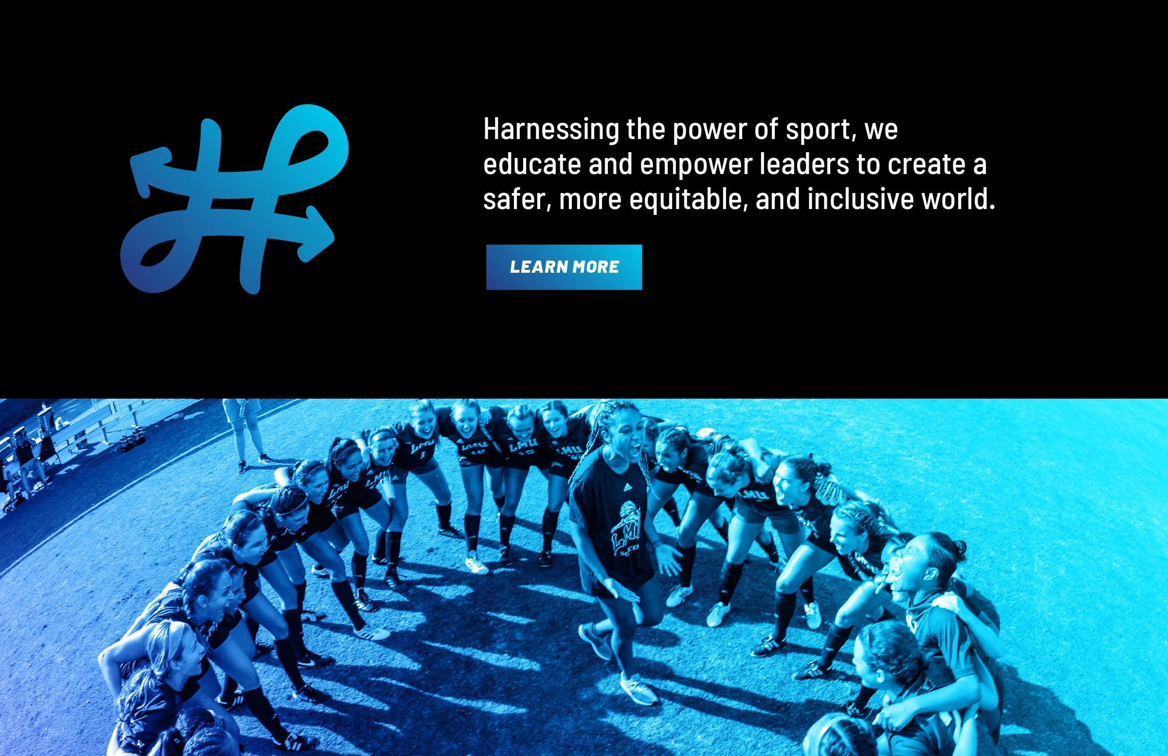
As Designer at Arrow, I was asked to create a new logo and visual identity for The Huddle. Formerly known as the Institute for Sport and Social Justice, Arrow had just completed brand messaging for the newly renamed organization, whose purpose is to equip and embolden athletes and teams to create a better, safer, more inclusive world.
ClientInstitute for Sport & Social Justice
My ContributionLogo & Visual Identity Design
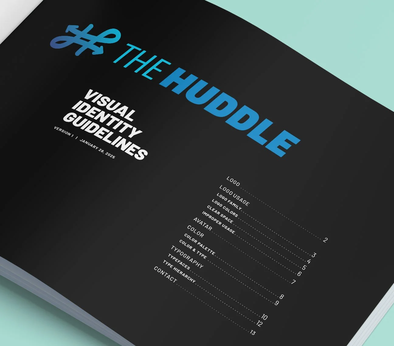
Visual Identity Guidelines
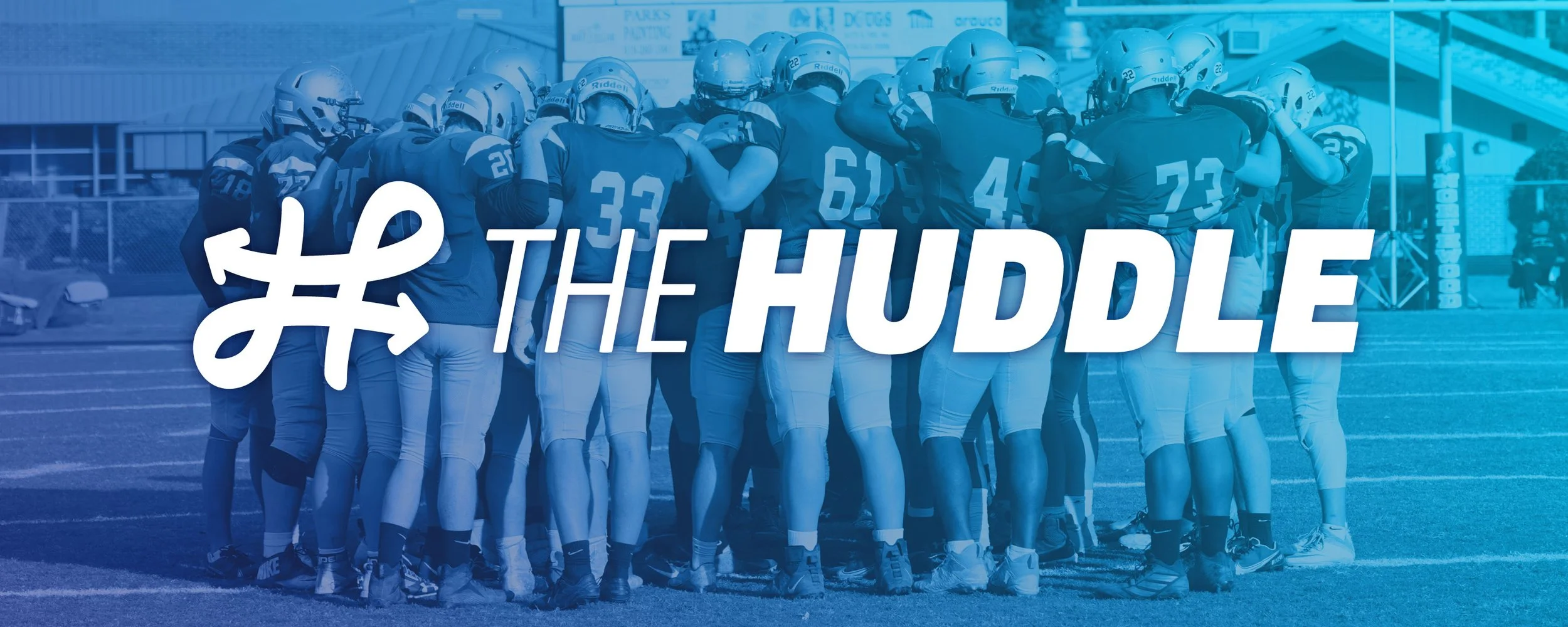
The Logo
Working off The Huddle’s new strategic vision (Change Me. Change Us. Change the World.) as well as the concept of the nature of a huddle, I created a logo mark with a subtle H shape. Formed by hand-drawn arrows reminiscent of a playbook, the mark’s two diverging lines loop back around toward each other, and then disperse. These lines embody a huddle: individuals coming together, changing themselves and their teammates through the work that they do, and going back out into the world to turn their new knowledge into action.
Change Me.
Change Us.
Change the World.


Visual Identity Guidelines
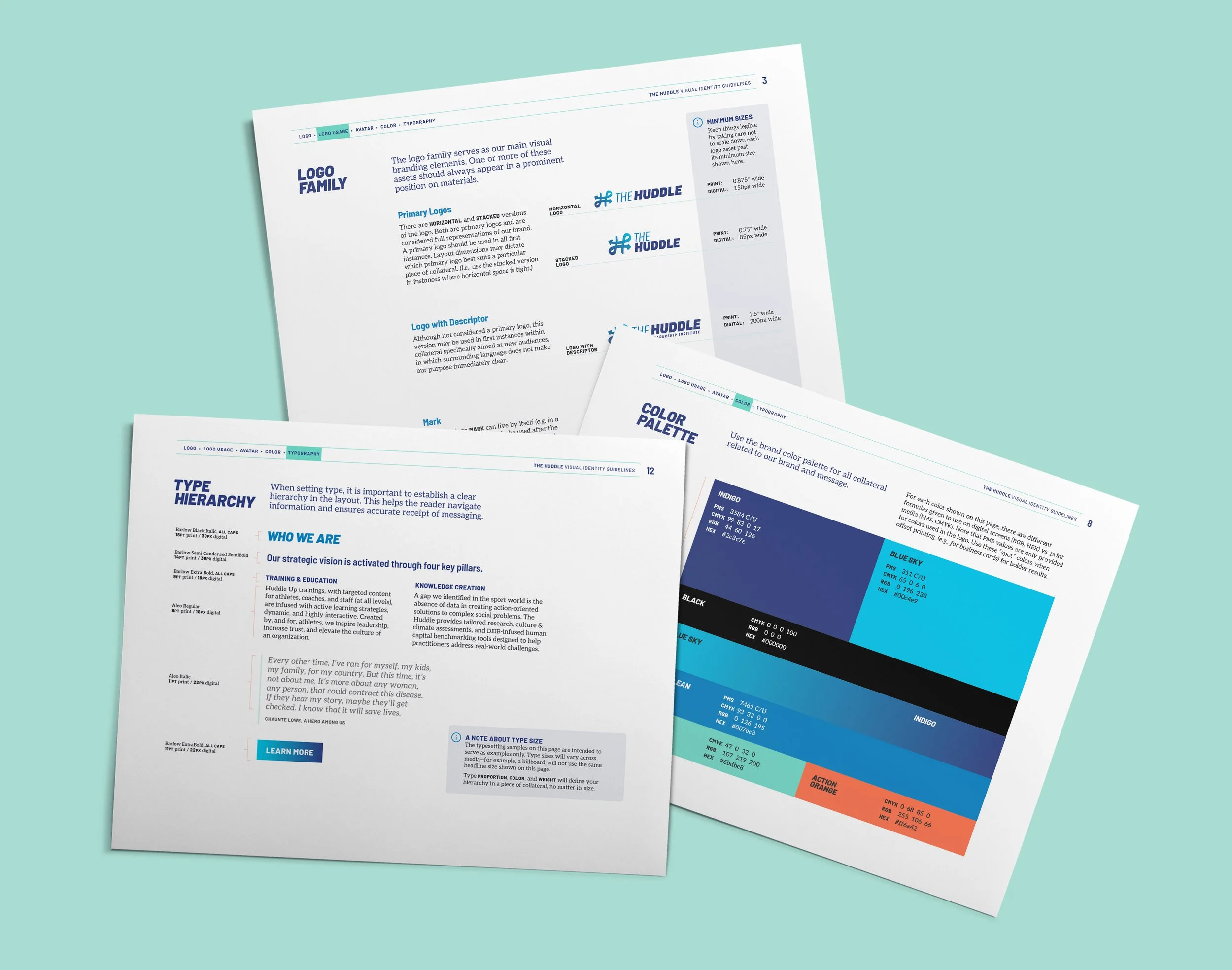
Guidelines include rules for logo usage, brand color palette, and brand typography. Since the Huddle is a nonprofit, I chose fonts available to license for free through Google Fonts. Barlow’s semi-rounded corners and various widths and weights paired well with the logo, making it ideal for display. Aleo is a sporty, contemporary variable slab serif with semi-rounded details, making it ideal for long-form text.